Feminists were rightly annoyed a couple decades back when Mattel released a talking Barbie doll who had among its canned sound bites the phrase “Math is hard!” But does it help the cause of gender parity in math and science to propose that there is a distinct feminist perspective on data?
This is the question of a recent book from MIT Press (which seems to specialize in bizarre leftist books), entitled Data Feminism. Here’s part of the description from MIT Press:
Today, data science is a form of power. It has been used to expose injustice, improve health outcomes, and topple governments. But it has also been used to discriminate, police, and surveil. This potential for good, on the one hand, and harm, on the other, makes it essential to ask: Data science by whom? Data science for whom? Data science with whose interests in mind? The narratives around big data and data science are overwhelmingly white, male, and techno-heroic. In Data Feminism, Catherine D’Ignazio and Lauren Klein present a new way of thinking about data science and data ethics—one that is informed by intersectional feminist thought.
Illustrating data feminism in action, D’Ignazio and Klein show how challenges to the male/female binary can help challenge other hierarchical (and empirically wrong) classification systems. They explain how, for example, an understanding of emotion can expand our ideas about effective data visualization, and how the concept of invisible labor can expose the significant human efforts required by our automated systems. And they show why the data never, ever “speak for themselves.”
Is there anything intersectionality can’t do? I’m wondering why the Marvel folks haven’t come up with a film superhero called “Intersectional Person.”
More seriously, the issue of selection bias in social science research is entirely legitimate, but from what I can tell data feminism mostly reduces to the complaint that there’s not enough social science rooted in the standard left-social justice narrative. And then there are the parts that arguably reinforce the old gender stereotypes that lead to things like math-phobic Barbies. In addition to critiques of data manipulation, there are some curious complaints about how data looks—even the colors used in charts and such.
In an interview, one of the co-authors takes after the “minimalist” data presentation formats championed by the legendary data maven Edward Tufte:
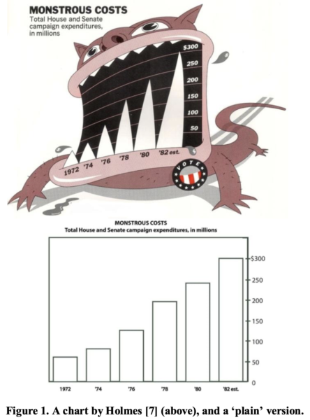
We’re not the first to criticize the data-ink ratio, as there have been folks from the art spaces who have looked at maximalist data visualization. . .
There’s a great paper by Scott Bateman and others, that shows a great example by Nigel Holmes with a monster. Edward Tufte criticizes this as a terrible distortion of things, but actually in a lot of ways it makes sense if you’re thinking with your designer or artist hat. Because if we use things like novelty and attention-grabbing tactics, they are the emotional aspects of communication that Tufte would banish. We actually see these are really good for recognition, learning, and remembering. Plus it’s just more fun!
The authors prefer the top version here (which slightly distorts the trend in increasing campaign costs), as opposed to the bottom version:
Does this direct appeal to emotionalism really help the cause of feminism? I’ll await an explanation from Feminist Barbie some day.
Notice: All comments are subject to moderation. Our comments are intended to be a forum for civil discourse bearing on the subject under discussion. Commenters who stray beyond the bounds of civility or employ what we deem gratuitous vulgarity in a comment — including, but not limited to, “s***,” “f***,” “a*******,” or one of their many variants — will be banned without further notice in the sole discretion of the site moderator.