This chart was created by John Burn-Murdoch of the Financial Times, where he is, I take it, a statistical analyst. It charts coronavirus deaths by country, beginning on the date when each country recorded its tenth death. Click to enlarge:

Some observations:
1) The Chinese curve, assuming it is anywhere near accurate, suggests that hysteria over the virus is vastly overblown. New cases and deaths there have dropped off to almost nothing. (According to the World Health Organization, only 29 new cases and 14 deaths in the last 24 hours.)
2) We should figure out what the Koreans have done, and imitate it.
3) Iran may be on the worst trajectory. Its numbers are likely to be fictitious.
4) Both Italy and Spain have relatively elderly populations, which I assume accounts for the relatively rapid spread of coronavirus in those countries.
5) Compared with most countries, the U.S. is off to a good start.
UPDATE: A neurosurgeon from the D.C. area suggests that the most relevant metric is deaths per capita; he prepared this chart, which shows deaths per million population starting with the first reported fatality. Click to enlarge:

He comments:
When controlled for population (deaths/1M Population), the US is doing quite well. China had a much lower death rate/capita at this stage in the game . . . but they contained the virus primarily to the Wuhan district (for this calculation, the entire Chinese population was used, and reduces their per capita disproportionately). Canada is pretty low right now. Japan performs the best per capita.
Some people don’t like the fact that most charts of this sort are done on a logarithmic scale; a friend of mine who is a numbers guy created this chart which shows the same data on a linear scale. You may or may not find it easier to interpret. The numbers, by the way, are taken from the World Health Organization’s current Situation Report, which I have linked to in prior posts. Click to enlarge:

This one, like the neurosurgeon’s, shows fatalities per million inhabitants, but it is logarithmic. It shows the world, China, Hubei province, the US, Italy and South Korea:
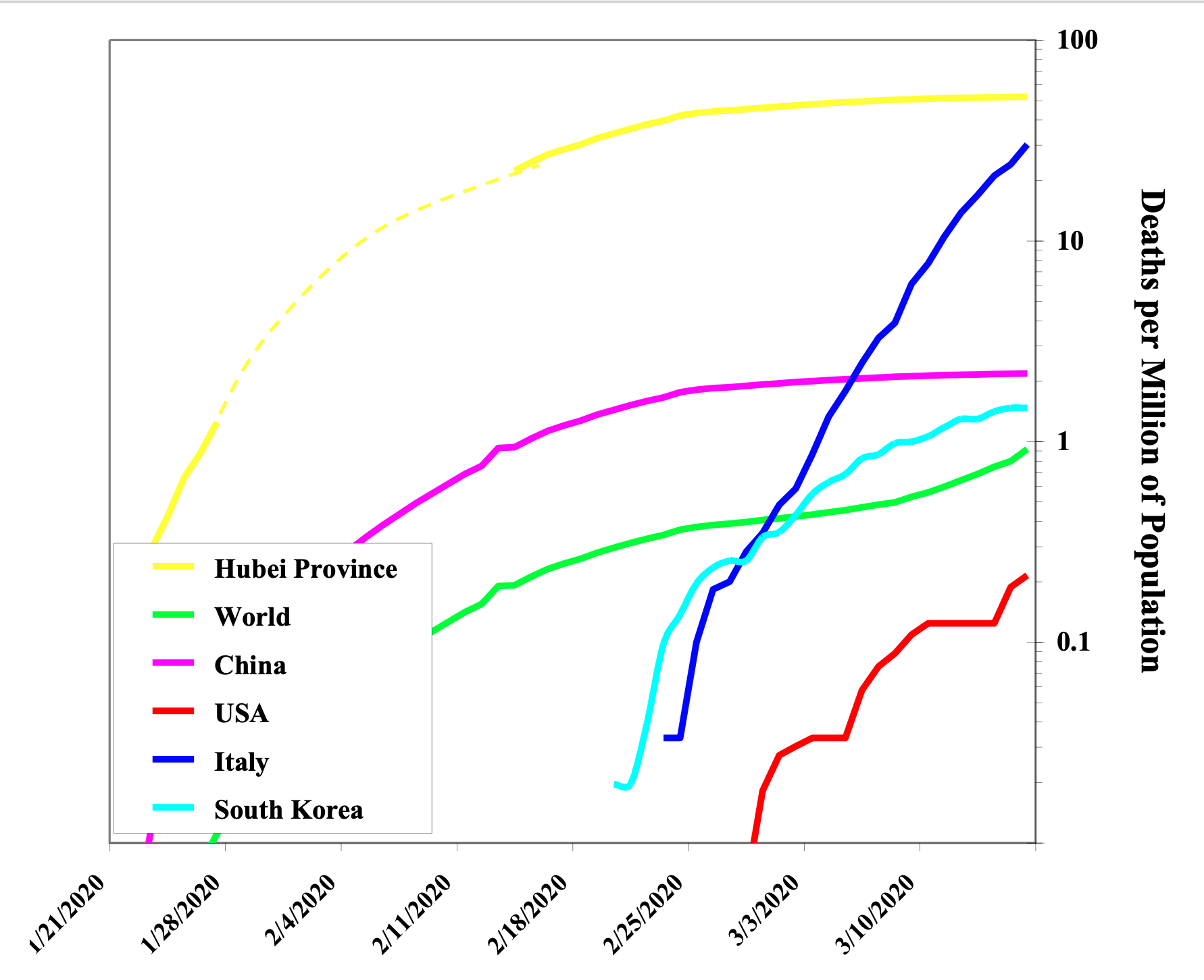
You can’t depict a complex situation in a single chart, but my takeaway from all of the above is that the U.S. is off to a good start in combatting the virus. At this point, I am a lot more worried about the economy than about COVID-19.