The long-time image of Republicans as the “party of the rich” and country club types is no longer true. Both charts demonstrate that Democrats have become the dominant party of upper-income households.

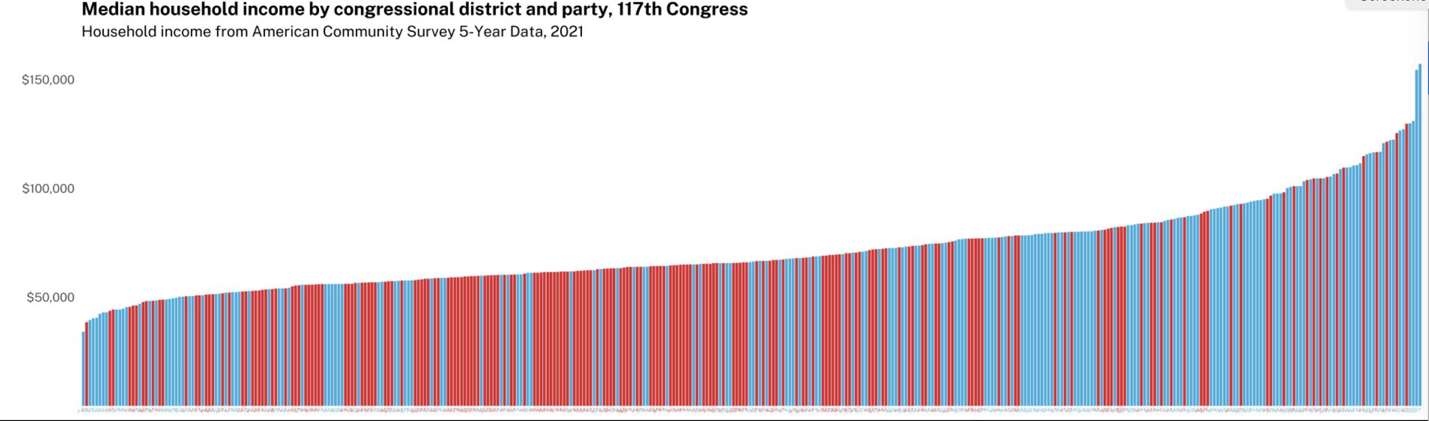
This second chart is the same idea from the 117th Congress (last term in other words) presented in a different format that is actually easier to understand than the scatterplot above. The horizontal x-axis shows all 435 congressional districts by median household income level and party representation (red-blue as usual), showing that Democrats now dominate upper-income House districts, which Republicans represent the middle- and working-classes.