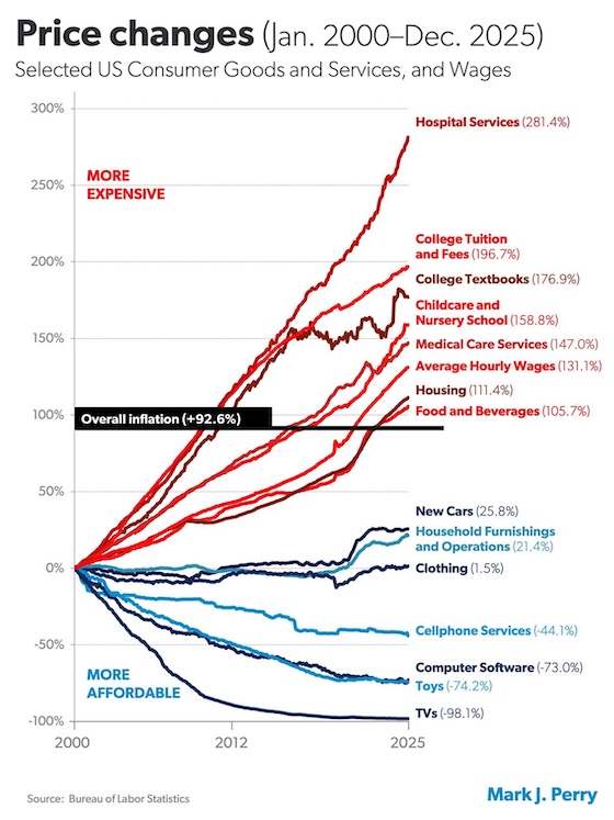
This graphic has been all over X for the last few days, and I have been meaning to get to it. It is similar to many other charts I have seen over the years. We all know that the cost of living has been rising, especially during the Biden administration. But many are not aware of how targeted those increasing costs actually are. Many goods and some services have gotten notably cheaper, compared to incomes, over the last 25 years. Conversely, some services–hardly any goods–have gotten much more expensive.
One way to look at it is that the most labor-intensive services are the ones that have gotten unaffordable. The other factor is that everything the government has tried to make more affordable, has gotten much less affordable. There is no mystery here: if you subsidize something by adding many billions of dollars on the demand side, and don’t do anything to eliminate obstacles on the supply side, you obviously are going to increase prices. And then, if you are a Democrat, demand even more subsidies:
The world would be a different place if the majority of people had even a primitive grasp of economics.
