The New York Times has probably put out more significant misinformation than any other news outlet over the last 40 years. Being scrupulously fair, I admit that the National Enquirer may have propounded even more fake stories than the Times, but the Enquirer’s misinformation is generally insignificant–three-headed calves, cabbages that look like Jesus, and the like–while the Times’ lies are important, like the Russia collusion hoax.
Here is a nice example of how the Times misleads its readers–although again, to be entirely fair, it is possible that Times reporters are so bad at math that the error was accidental. The story was Women in Their 20s May Not Be Having Babies, But by 45 Most Probably Will. The point of the story was to reassure readers: concerns about demographic decline are misplaced. This chart was the centerpiece of the story:
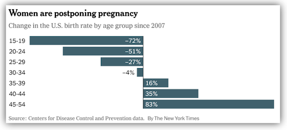
To those unversed in statistics (or common sense), the chart is reassuring: declining births among those under 30 are being offset by increasing births among those over 35. But the chart is in percentages, and if you give it a moment’s thought, you will realize that women in their 20s have a lot more children than women over 35. This chart shows the real, and disquieting, facts, using the actual numbers:
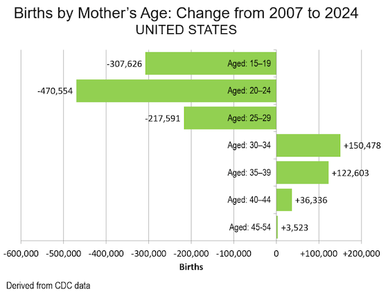
Yes, women over 40 are having more children, and God bless ’em for it. But that increase obviously can’t make up for the decreasing births among women in their childbearing prime. The United States is suffering demographic decline, and it is, or should be, a serious concern.
I think most readers of the New York Times are below average in basic mathematical skills, like most Times reporters and editors. This is unfortunate in an era when data is ubiquitous and statistics are all around us. If you don’t have at least an elementary understanding of statistics, you can’t be an informed voter. And I am afraid that leaves out most of the Times readership.
