The great thing about doing charts and graphs is that one can avoid the train wreck that is the British royal family engaging with America’s Queen Oprah. Though I suppose we could do an IQ bar graph for the males of the House of Flying Windsors starting with Prince Charles. The Y-axis wouldn’t need to go above 100.
• Let’s start with what the soaring cost of the health care sector has in common with higher education:

Gee—I wonder if there is something these two sectors have in common?
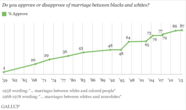
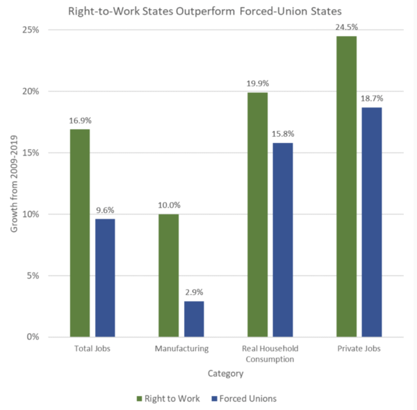
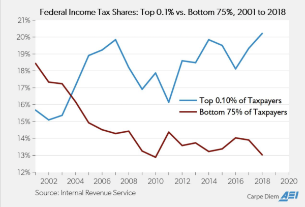
• But never forget—the U.S. is a deeply racist country:

Here’s what the COVID shutdown has done to restaurant employment in Michigan:

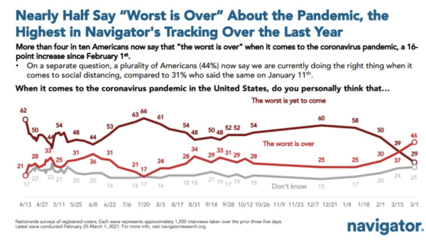

This chart is more than a week out of date, but still makes the point:
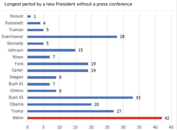
And finally. . .

Notice: All comments are subject to moderation. Our comments are intended to be a forum for civil discourse bearing on the subject under discussion. Commenters who stray beyond the bounds of civility or employ what we deem gratuitous vulgarity in a comment — including, but not limited to, “s***,” “f***,” “a*******,” or one of their many variants — will be banned without further notice in the sole discretion of the site moderator.