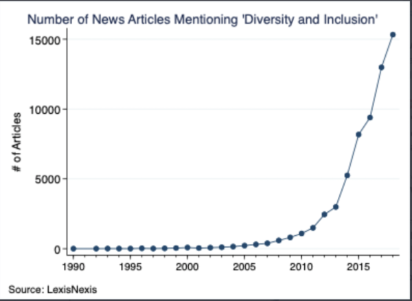
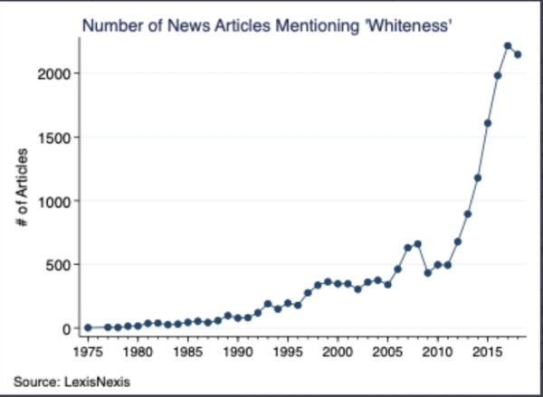
• These first few charts from the great Zach Goldberg are a couple years old, but it is worth aggregating them again to demonstrate how wokery broke out from the campus and took over the media. But could this be a woke bubble about to burst? Surveys show large majorities of Americans hate this business.


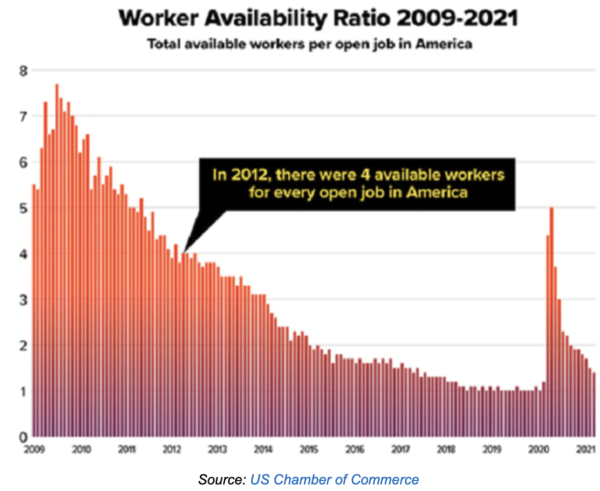
• The economy continues to be weird.


Or in bar chart form:


Contrary indicator: if the “surprise index” is going down, expect a surprise:


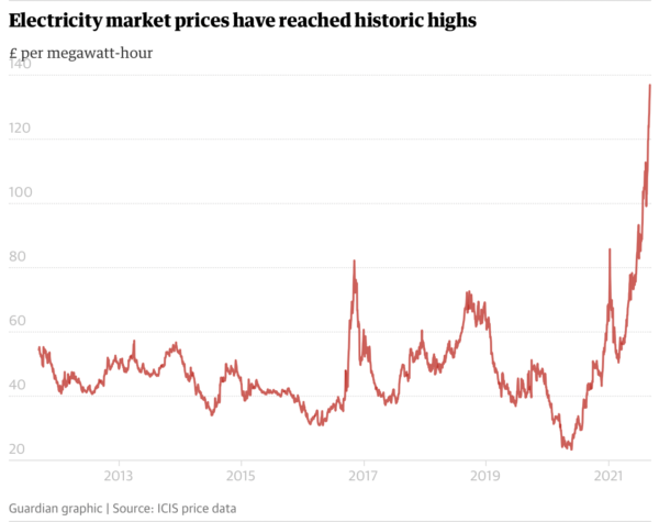
No wonder Britain is turning its coal plants back on again:
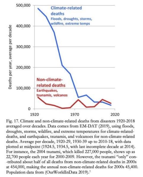
• Some climate stuff:

• China: big argument over this chart, which shows that “GINI” inequality soared when the country first started growing (as I would expect), but then leveled off when growth really took off, which is also what I’d expect. But AOC-types are in a snit about this.

FWIW:

Gee, I wonder if this has something to do with government intervention in health care:


And finally. . .

Notice: All comments are subject to moderation. Our comments are intended to be a forum for civil discourse bearing on the subject under discussion. Commenters who stray beyond the bounds of civility or employ what we deem gratuitous vulgarity in a comment — including, but not limited to, “s***,” “f***,” “a*******,” or one of their many variants — will be banned without further notice in the sole discretion of the site moderator.