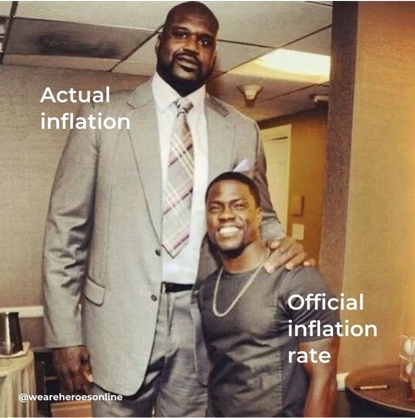
Most news accounts of inflation report chiefly on the aggregate “headline” rate, lately above 8 percent. But when you break out price levels by subcategories, you can see that many of the things that consumer spend most of their income for have risen much more than 8 percent over the last year (especially fuel oil, which many households in the northeast use for winter heating), suggesting that real inflation is higher than the headline number for most people.

Though this chart maybe simpler:
Notice: All comments are subject to moderation. Our comments are intended to be a forum for civil discourse bearing on the subject under discussion. Commenters who stray beyond the bounds of civility or employ what we deem gratuitous vulgarity in a comment — including, but not limited to, “s***,” “f***,” “a*******,” or one of their many variants — will be banned without further notice in the sole discretion of the site moderator.