Let’s go with a couple of maps today instead of charts and graphs or tables. First up, while Britain’s Tory Party appears heading for an electoral wipeout at the next general election—the first since their historic sweep in 2019—chiefly because the Tories have governed as though their cabinet positions were inhabited by alien body snatchers from Planet Labour, over on the continent, right- or populist-leaning parties continue to gain ground nearly everywhere. Like Greece this week:
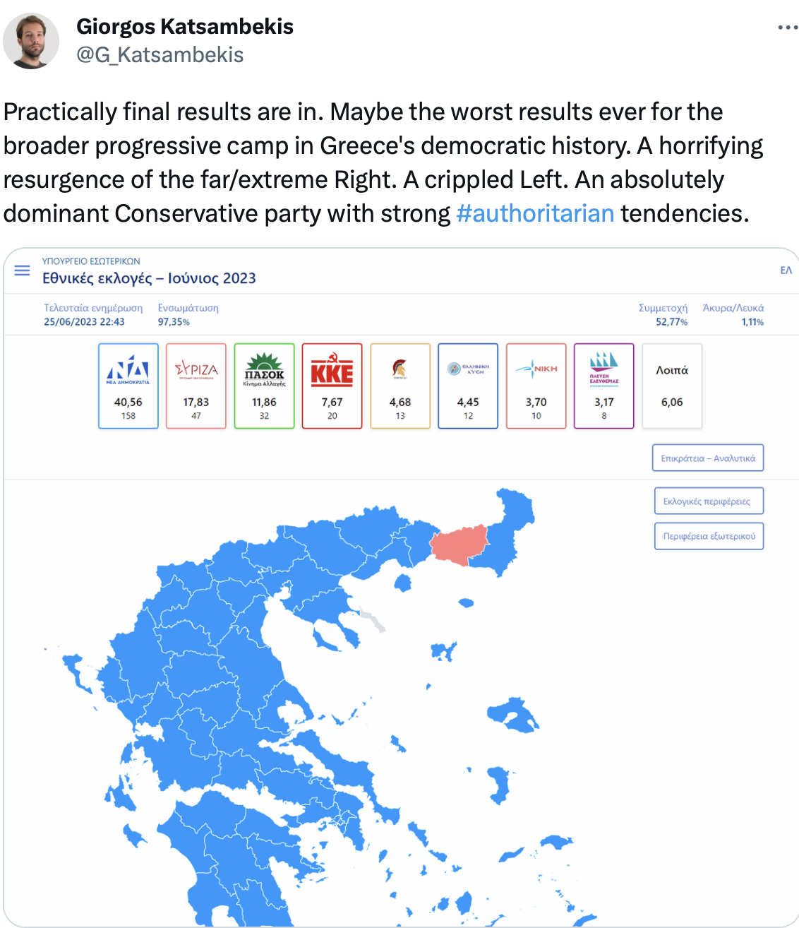
I don’t know who this Katsambekis fellow is, but when I read his description of the results, I say: “What’s not to like?”
Meanwhile, when you hear the climatistas talk about energy in the developing world, keep in mind how many people don’t have access to any electricity at all, or have access but not at a price they can afford:
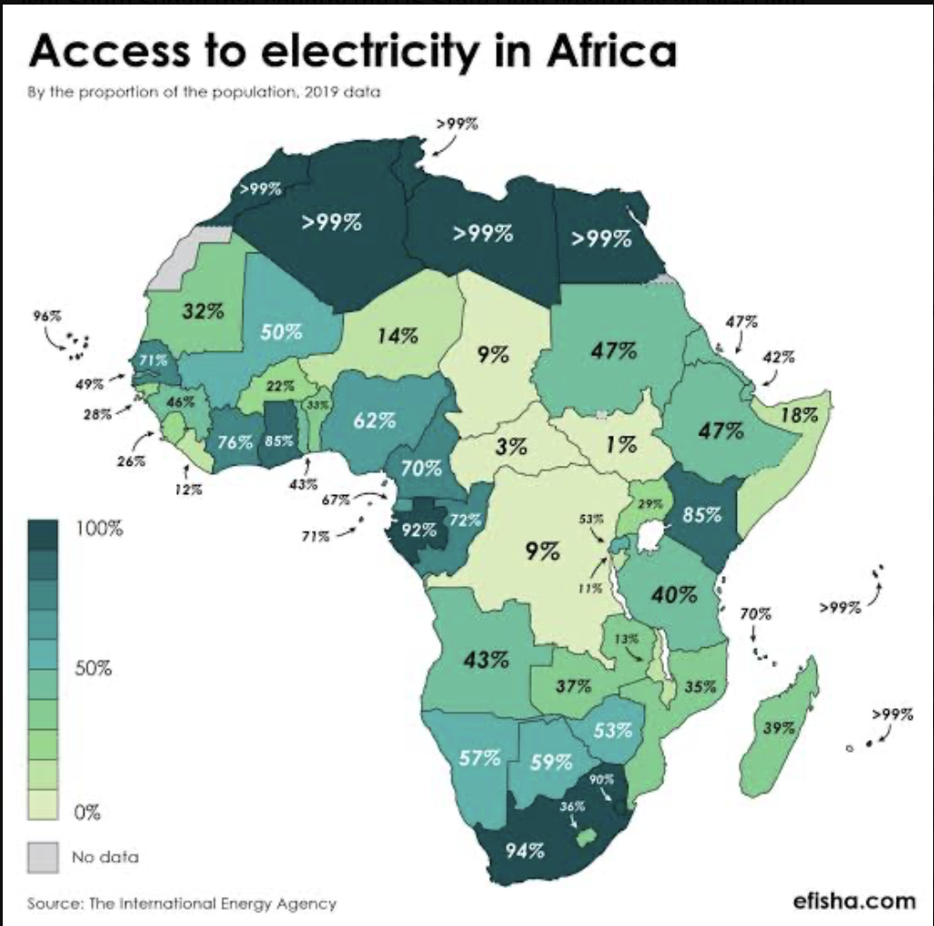
Heat map indeed.