The media is going full climatista right now with coverage of summer heat that is both “record-breaking” (it’s not in most instances) and proof of climate change. Back in March The Lancet, a once prestigious medical journal that has disgraced itself in recent years and even retracted articles based on wholly falsified data, published an article that attempted to estimate deaths from heat and cold in European cities over the last 20 years. One of the facts that I noted in my New York Post article last week is that deaths from cold weather are ten times as high as deaths from heat, yet somehow this never gets any mention in the media.
Here’s how The Lancet presents their estimates in a chart, which seems to show that cold deaths are not that much larger than heat deaths, and thus global warming is a big threat:
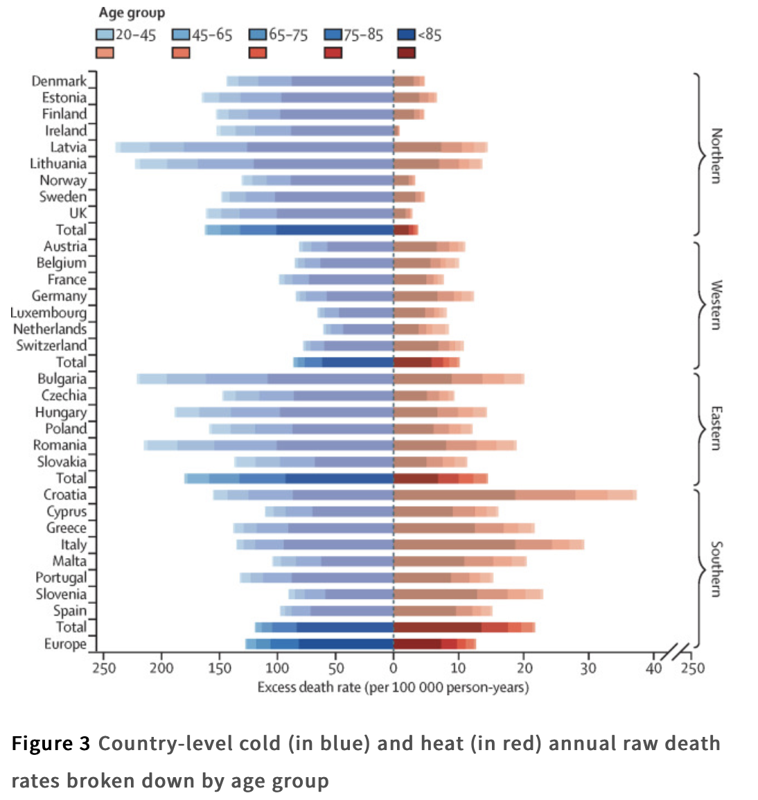
Notice anything off about this chart? How about the different scales for the X-axis for cold and heat deaths? Notice here if you missed it:

If these data were presented with a constant X-axis scale (as it ought to be done), it would look like this (hat tip: Bjorn Lomborg):

Here’s the different between the original and Lomborg’s revised version:

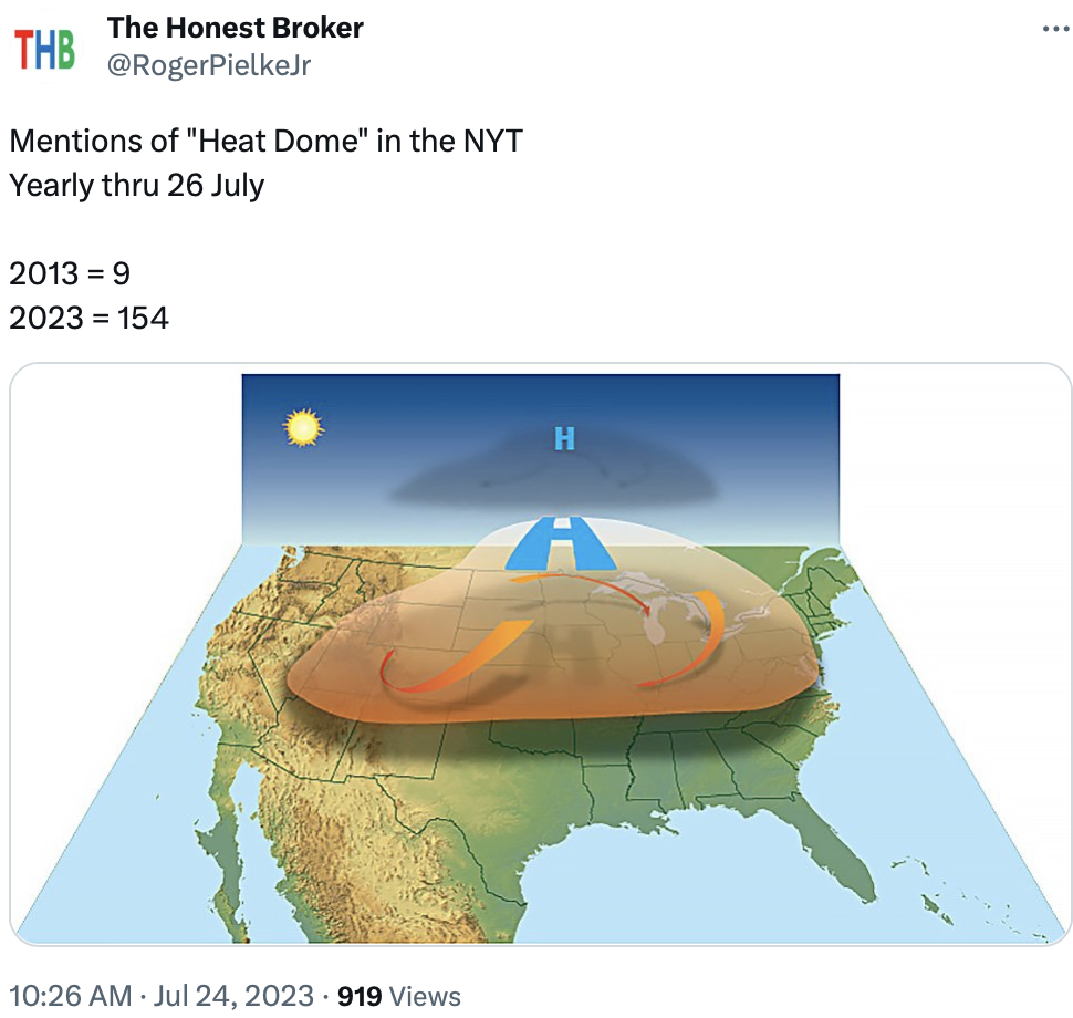
Chaser—Roger Pielke Jr. notices this about current media coverage of the summer: