Climate change hysteria has been dialed up to 11 over the last year or two. Greta Thunberg, the Swedish teenager who knows little or nothing about the subject, apparently will continue being nominated for a Nobel Prize until she wins one. But, hype aside, what is actually going on with the Earth’s climate?
Anthony Watts offers seven charts that show the effects of the last decade of alleged global warming. The first one has to do with the beneficial effects of increasing CO2–plant food–in the atmosphere.
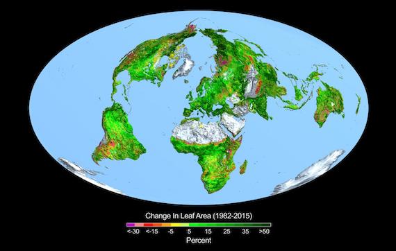
From a quarter to half of Earth’s vegetated lands has shown significant greening over the last 35 years largely due to rising levels of atmospheric carbon dioxide, according to a new study published in the journal Nature Climate Change on April 25 2016.
***
The greening over the past 33 years reported in this study is equivalent to adding a green continent about two times the size of mainland USA (18 million km2)…
This image shows the change in leaf area across the globe from 1982-2015.
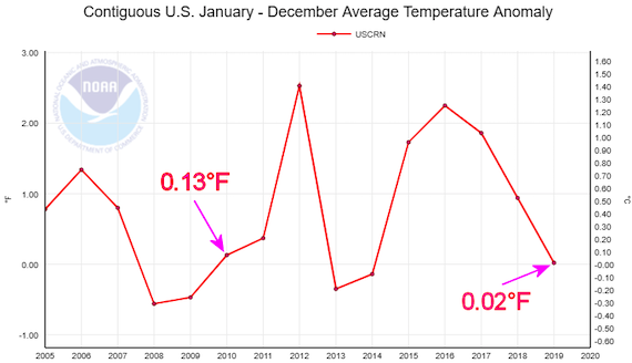
We constantly hear that temperatures are setting new records, but in reality, according to NOAA’s United States Climate Reference Network, average temperatures in the U.S. in 2019 were cooler than they had been at the start of the decade. The two peaks were, as usual, naturally-occurring El Nino years:
The alarmists’ models were created by activists to predict problematic levels of warming. That was the whole point. Unfortunately for the alarmists, enough time has now gone by that we can say, definitively, that the models are wrong. They grossly exaggerated any mild warming that has actually occurred. And a model that produces wrong predictions is worthless.
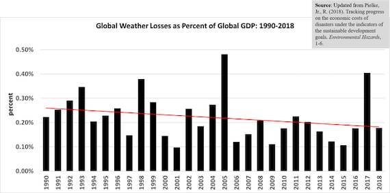
This, I think, is why the Left shifted its focus to “extreme weather events.” Apparently there are people alive today so ill-informed that they are surprised by storms, floods, droughts, fires, etc., apparently believing that these are new phenomena. This chart shows the economic cost of weather losses as a share of global GDP. Such losses have been declining, not increasing, even though coastal development has increased during the time period covered by the chart:
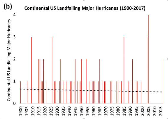
I don’t think economic losses are the best measure for the reason stated above, so here is a chart, from NOAA, that shows that major hurricane activity in the U.S. has been declining over a 100 year-plus period:
Finally, what about the “green revolution” that supposedly is bringing about a brave new world of “clean” wind and solar energy? First of all, wind and solar are anything but clean. Environmentally, it is debatable whether they are superior to coal, and they are plainly inferior to natural gas and nuclear power from an environmental perspective. But, putting that aside, is it true that alleged “renewables” are beginning to dominate energy markets?
Not really:
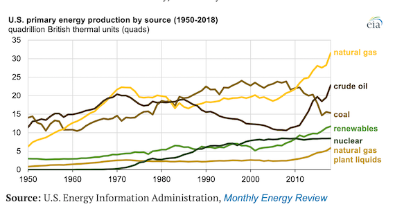
If it weren’t for federal subsidies and state mandates, so-called “renewables” wouldn’t be on the list at all. If you want to know more about the inherent futility of these energy sources, this is a good place to start.
Anthony Watts includes a United Nations poll showing that internationally, global warming ranks last among respondents’ concerns. Polls on this topic vary widely, but I think centuries of experience lead most people to believe that those who shriek hysterically, do so because they don’t have a good case. That, I think, is where the global warming movement is today.