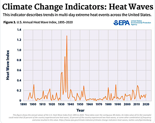
Each summer, whenever there is a heat wave, we are likely to see headlines touting the weather as evidence of global warming. But what do the data actually look like if you take a historical perspective? This Watts Up With That post provides a good overview of U.S. heat wave data. Here are some of the charts.
This is from the EPA, the U.S. Annual Heat Wave Index from 1895-2020:
These are from the Fourth U.S. National Climate Assessment in 2017:
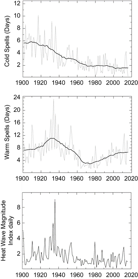
This one is from 671 individual U.S. Historical Climatology Network stations. It shows the number of days per station per decade that qualified under the technical “heat wave” definition. The gray bars represent the U.S. as a whole, while the other lines are regional. There have been shifting regional weather patterns, but when you average it out across the U.S., the decades of the 10s, 20s and 30s all had more heat wave days than we have had since:

If you read the linked post, it also addresses the *adjustments* that climate alarmists use to change the historical record to fit their theory.
Notice: All comments are subject to moderation. Our comments are intended to be a forum for civil discourse bearing on the subject under discussion. Commenters who stray beyond the bounds of civility or employ what we deem gratuitous vulgarity in a comment — including, but not limited to, “s***,” “f***,” “a*******,” or one of their many variants — will be banned without further notice in the sole discretion of the site moderator.